In the fast-paced digital era, where smartphones have become an integral part of our lives, ensuring that your WordPress site is mobile-friendly is no longer an option—it’s a necessity. With a growing number of users accessing websites on their mobile devices, optimizing your site for mobile users is crucial for delivering a seamless and satisfying user experience. In this blog post, we’ll explore the importance of mobile optimization for WordPress sites and how Techspawn Solutions can work its magic to enhance your mobile user experience.
The Significance of Mobile Optimization
1. User Experience Matters:
Mobile users expect a smooth and responsive browsing experience. If your WordPress site is not optimized for mobile devices, users may encounter slow loading times, distorted layouts, and frustrating navigation, leading to a high bounce rate.
2. Search Engine Friendliness:
Search engines, including Google, prioritize mobile-friendly websites in their rankings. A mobile-optimized site is more likely to appear higher in search results, increasing visibility and attracting more organic traffic.
3. Adaptability Across Devices:
Mobile optimization ensures that your WordPress site looks and functions well across various screen sizes and devices, including smartphones and tablets. This adaptability is crucial for reaching a broader audience.
How Techspawn Solution helps you to get your WordPress Site mobile friendly
Now that we understand the importance of mobile optimization, let’s delve into how Techspawn Solutions can work its magic to transform your WordPress site into a mobile-friendly masterpiece.
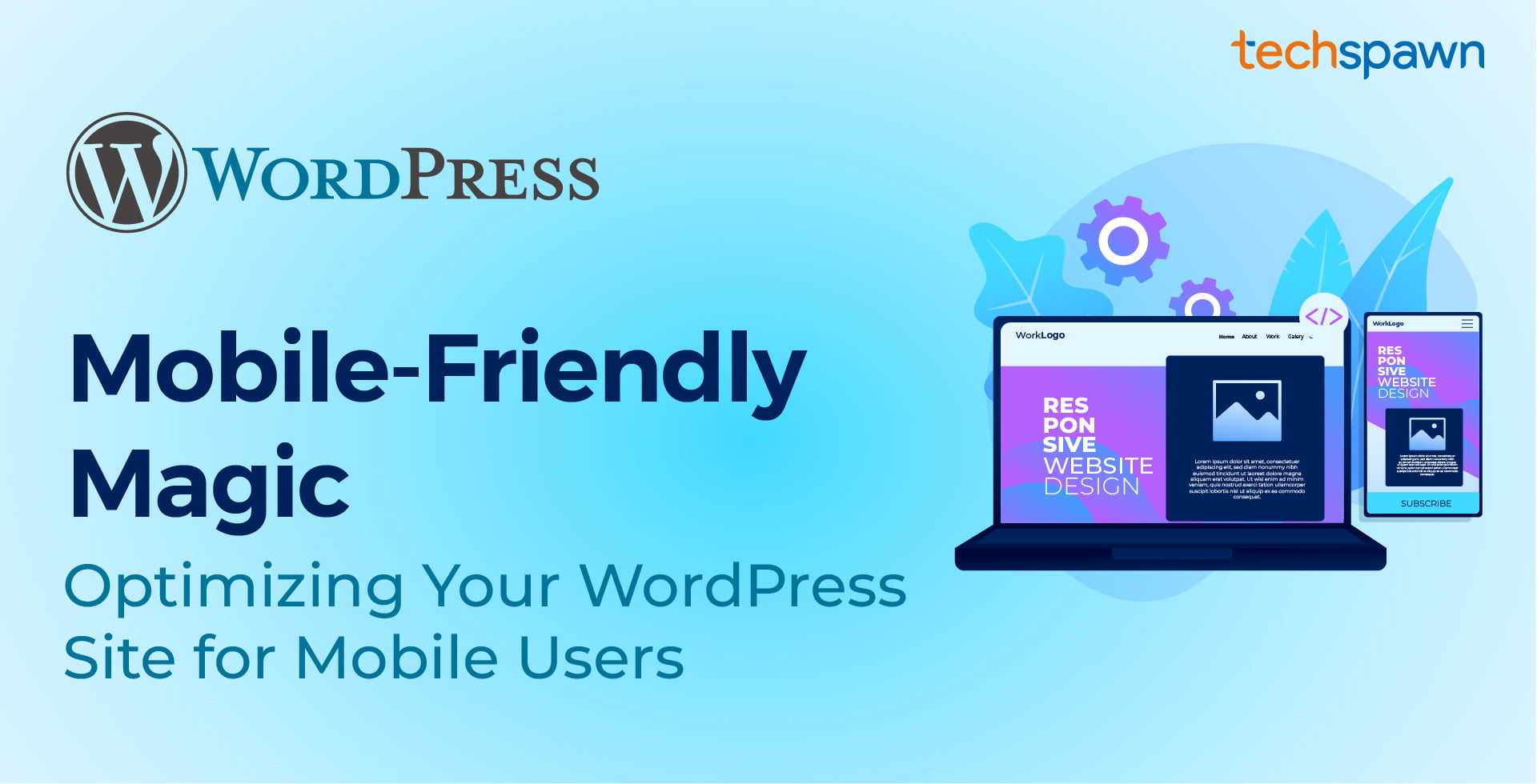
1. Responsive Web Design:
Techspawn Solutions employs responsive web design techniques to create a fluid and adaptive layout that adjusts seamlessly to different screen sizes. This ensures a consistent and visually appealing experience for your mobile users.
2. Image and Content Optimization:
Large images and excessive content can slow down your site on mobile devices. Techspawn Solutions optimizes images and content to strike the right balance between visual appeal and performance, ensuring quick load times and a delightful user experience.
3. Mobile-Friendly Themes:
Techspawn Solutions offers a variety of mobile-friendly themes tailored to your WordPress site’s needs. These themes are designed to enhance readability, navigation, and overall user experience on mobile devices.
3. Adaptability Across Devices:
Mobile optimization ensures that your WordPress site looks and functions well across various screen sizes and devices, including smartphones and tablets. This adaptability is crucial for reaching a broader audience.
4. Accelerated Mobile Pages (AMP):
Techspawn Solutions implements AMP, a Google-backed project, to create lightweight and fast-loading versions of your web pages. This not only improves user experience but also positively impacts your site’s search engine rankings.
5. User-Friendly Navigation:
Navigating a website on a smaller screen requires thoughtful design. Techspawn Solutions optimizes the navigation menu and ensures that users can easily access the most important sections of your site with minimal effort.
Conclusion
In the mobile-centric landscape of today, neglecting the optimization of your WordPress site for mobile users is a missed opportunity. Techspawn Solutions understands the nuances of mobile optimization and provides tailored solutions to enhance the mobile user experience on your WordPress site. By adopting their mobile-friendly magic, you not only meet the expectations of your audience but also position your site for better search engine visibility and long-term success in the digital realm. Embrace the mobile revolution with Techspawn Solutions and unlock the full potential of your WordPress site for users on the go.